001
/
Karst
Karst is a Norwegian mineral water brand sourced from deep limestone aquifers in the Telemark region. Founded by two former geologists, the company wanted a brand that honoured the science of what they had found — without disappearing into the cold, clinical aesthetics typical of the premium water category.

Challenge
The mineral water market is saturated with brands that either go ultra-minimal (white and pale blue) or lean heavily into alpine imagery. Karst needed a third path — something that felt geological, precise, and quietly confident without becoming a nature documentary.
Approach
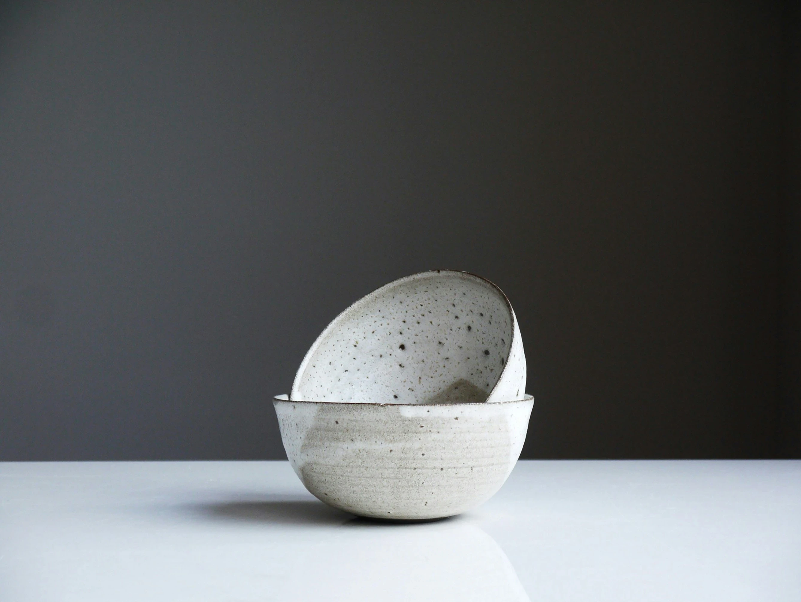
We began with the material itself. Limestone has a texture and colour that is neither stark white nor warm cream — it sits somewhere between. We built the identity around this ambiguity: a custom wordmark drawn with the weight of engraved stone, a palette of chalk, iron-grey, and deep mineral green, and a typographic system that owes more to scientific notation than to consumer branding.
The packaging uses embossed texture directly on the label stock — no photography, no illustration. Just material, type, and a small geological cross-section diagram that doubles as a brand mark.

Outcome
Karst launched in April 2025 in 320 independent restaurants and specialty retailers across Norway and Denmark. Within the first month, it was stocked by five Michelin-starred kitchens in Oslo. The brand was featured in Wallpaper* and nominated for a Pentaward.
Key results
320 stockists at launch
5 Michelin-starred placements (Oslo)
Featured in Wallpaper*, Dezeen
Pentaward nomination, 2025