004
/
Lune Collective
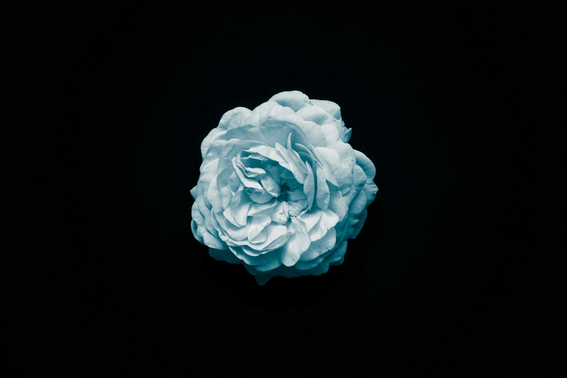
Lune Collective is a Copenhagen-based arts organisation running a programme of residencies, exhibitions, and public events across three venues. With a growing international profile and a membership programme that had tripled in two years, their piecemeal visual identity — accumulated across a decade of different hands — had become an obstacle to how they presented themselves.

Challenge
Cultural institutions face a specific identity problem: they need to recede far enough to let the work speak, but be present enough to build institutional recognition. Lune's previous identity was the former without the latter — so self-effacing it had become invisible. The new identity needed to create presence without imposing.
Approach
We took our structural cue from the organisation's name. A lune is a crescent-shaped geometric figure — the area between two intersecting circles. It is a shape defined by what two things share. We used this as a compositional principle rather than a literal mark: layouts built from overlapping fields, posters where image and typography occupy the same plane without hierarchy.
The typeface is a custom-modified grotesque — widened slightly, with spacing opened out — so it reads as both institutional and warm. The palette is restrained: off-white, deep Prussian blue, and a single copper accent used sparingly for hierarchy.
The system was designed to be managed in-house. We delivered editable templates in Figma for all print formats, a custom web font for the site, and a wayfinding guide for all three venues.

Outcome
The new identity launched with the Autumn 2024 programme. Membership renewals in the first quarter post-launch were up 22%. The identity was shortlisted for a Danish Design Award in the Cultural Identity category.
Key results
+22% membership renewals, Q4 2024
Shortlisted, Danish Design Award 2024
System covers 14 print formats + digital
Delivered in 11 weeks